How To Add Superhero Pre-Loader In Website

Hello freinds,
today i am going to show you how to add Pre-Loader in Website with Two Best example of Pre-Loader animation
Please scroll and Check the below given examples of Pre-Loaders. Select one of them and copy the Code/Script of that loader which you like.
Superman Pre-Loader
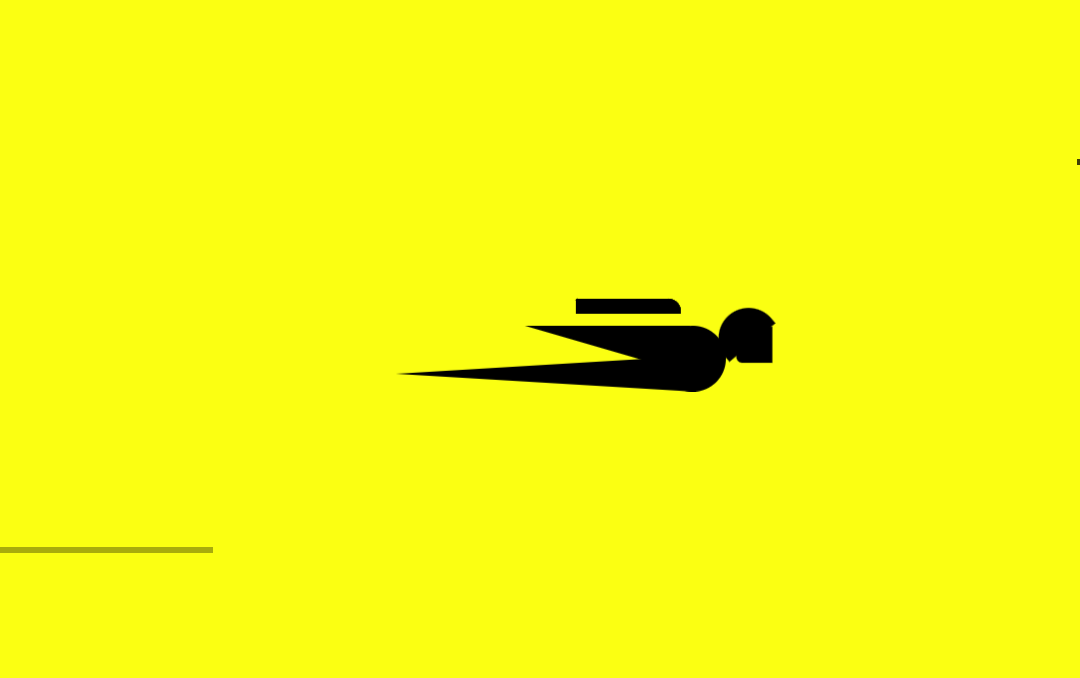
Code
Double tap on code to copy !<style>
.loadd {
position: fixed;
background: #fbff12;
z-index: 1000;
top: 0;
left: 0;
width: 100%;
height: 100vh
}
.body {
position: absolute;
top: 50%;
margin-left: -50px;
left: 50%;
animation: speeder .4s linear infinite
}
.body > span {
height: 5px;
width: 35px;
background: #000000;
position: absolute;
top: -19px;
left: 60px;
border-radius: 2px 10px 1px 0
}
.base span {
position: absolute;
width: 0;
height: 0;
border-top: 6px solid transparent;
border-right: 100px solid #000000;
border-bottom: 6px solid transparent
}
.base span:before {
content: "";
height: 22px;
width: 22px;
border-radius: 50%;
background: #000000;
position: absolute;
right: -110px;
top: -16px
}
.base span:after {
content: "";
position: absolute;
width: 0;
height: 0;
border-top: 0 solid transparent;
border-right: 55px solid #000000;
border-bottom: 16px solid transparent;
top: -16px;
right: -98px
}
.face {
position: absolute;
height: 12px;
width: 20px;
background: #000000;
border-radius: 20px 20px 0 0;
transform: rotate(-40deg);
right: -125px;
top: -15px
}
.face:after {
content: "";
height: 12px;
width: 12px;
background: #000000;
right: 4px;
top: 7px;
position: absolute;
transform: rotate(40deg);
transform-origin: 50% 50%;
border-radius: 0 0 0 2px
}
.body > span > span:nth-child(1),
.body > span > span:nth-child(2),
.body > span > span:nth-child(3),
.body > span > span:nth-child(4) {
width: 30px;
height: 1px;
background: #000000;
position: absolute;
animation: fazer1 .2s linear infinite
}
.body > span > span:nth-child(2) {
top: 3px;
animation: fazer2 .4s linear infinite
}
.body > span > span:nth-child(3) {
top: 1px;
animation: fazer3 .4s linear infinite;
animation-delay: -1s
}
.body > span > span:nth-child(4) {
top: 4px;
animation: fazer4 1s linear infinite;
animation-delay: -1s
}
@keyframes fazer1 {
0% {
left: 0
}
100% {
left: -80px;
opacity: 0
}
}
@keyframes fazer2 {
0% {
left: 0
}
100% {
left: -100px;
opacity: 0
}
}
@keyframes fazer3 {
0% {
left: 0
}
100% {
left: -50px;
opacity: 0
}
}
@keyframes fazer4 {
0% {
left: 0
}
100% {
left: -150px;
opacity: 0
}
}
@keyframes speeder {
0% {
transform: translate(2px, 1px) rotate(0deg)
}
10% {
transform: translate(-1px, -3px) rotate(-1deg)
}
20% {
transform: translate(-2px, 0px) rotate(1deg)
}
30% {
transform: translate(1px, 2px) rotate(0deg)
}
40% {
transform: translate(1px, -1px) rotate(1deg)
}
50% {
transform: translate(-1px, 3px) rotate(-1deg)
}
60% {
transform: translate(-1px, 1px) rotate(0deg)
}
70% {
transform: translate(3px, 1px) rotate(-1deg)
}
80% {
transform: translate(-2px, -1px) rotate(1deg)
}
90% {
transform: translate(2px, 1px) rotate(0deg)
}
100% {
transform: translate(1px, -2px) rotate(-1deg)
}
}
.longfazers {
position: absolute;
width: 100%;
height: 100%
}
.longfazers span {
position: absolute;
height: 2px;
width: 20%;
background: #000000
}
.longfazers span:nth-child(1) {
top: 20%;
animation: lf .6s linear infinite;
animation-delay: -5s
}
.longfazers span:nth-child(2) {
top: 40%;
animation: lf2 .8s linear infinite;
animation-delay: -1s
}
.longfazers span:nth-child(3) {
top: 60%;
animation: lf3 .6s linear infinite
}
.longfazers span:nth-child(4) {
top: 80%;
animation: lf4 .5s linear infinite;
animation-delay: -3s
}
@keyframes lf {
0% {
left: 200%
}
100% {
left: -200%;
opacity: 0
}
}
@keyframes lf2 {
0% {
left: 200%
}
100% {
left: -200%;
opacity: 0
}
}
@keyframes lf3 {
0% {
left: 200%
}
100% {
left: -100%;
opacity: 0
}
}
@keyframes lf4 {
0% {
left: 200%
}
100% {
left: -100%;
opacity: 0
}
}
</style>
<div class='loadd'>
<div class='body'>
<span></span>
<span></span>
<span></span>
<span></span>
<div class='base'>
<span></span>
<div class='face'></div>
</div>
</div>
<div class='longfazers'>
<span></span>
<span></span>
<span></span>
<span></span>
</div>
</div>
<script src='//ajax.googleapis.com/ajax/libs/jquery/2.0.0/jquery.min.js'></script>
<script type='text/javascript'>
$(window).load(function () {
setTimeout(function () {
$(".loadd").fadeOut("slow");
}, 500)
});
</script> Tutorial
- Double tap of code to copy it
- Go to your website control panel or dashboard
- Go to layout section
- Create a HTML widget in Home section of layout
- Paste the above given code in widget which you create in Home section of layout
- Save your settings


Comments
Post a Comment